Alliums have a lovely architectural feel, with such intricate fine detail, numerous filaments each carrying a clutch of black seeds. I have had a number of them drying in my studio for years. I wanted to photograph the Allium with the sun behind and I cut out a piece of acid-free tissue to sit in the middle of the seedhead ball to add to the mystery. The seeds at the rear of the ball and the stem then rendered as a shadow adding depth to the image.
The way I wanted to create the etching of this image was to use a single exposure solar etching, so that the black seeds would become white ghosts, to dramatise unfulfilled potential. I also wanted to completely fill a sheet of Somerset paper (560 x 760 mm if you want to know) and so I used four A3-ish plates.

I developed using Photoshop to create the four strongly contrasty black and white acetate positives.
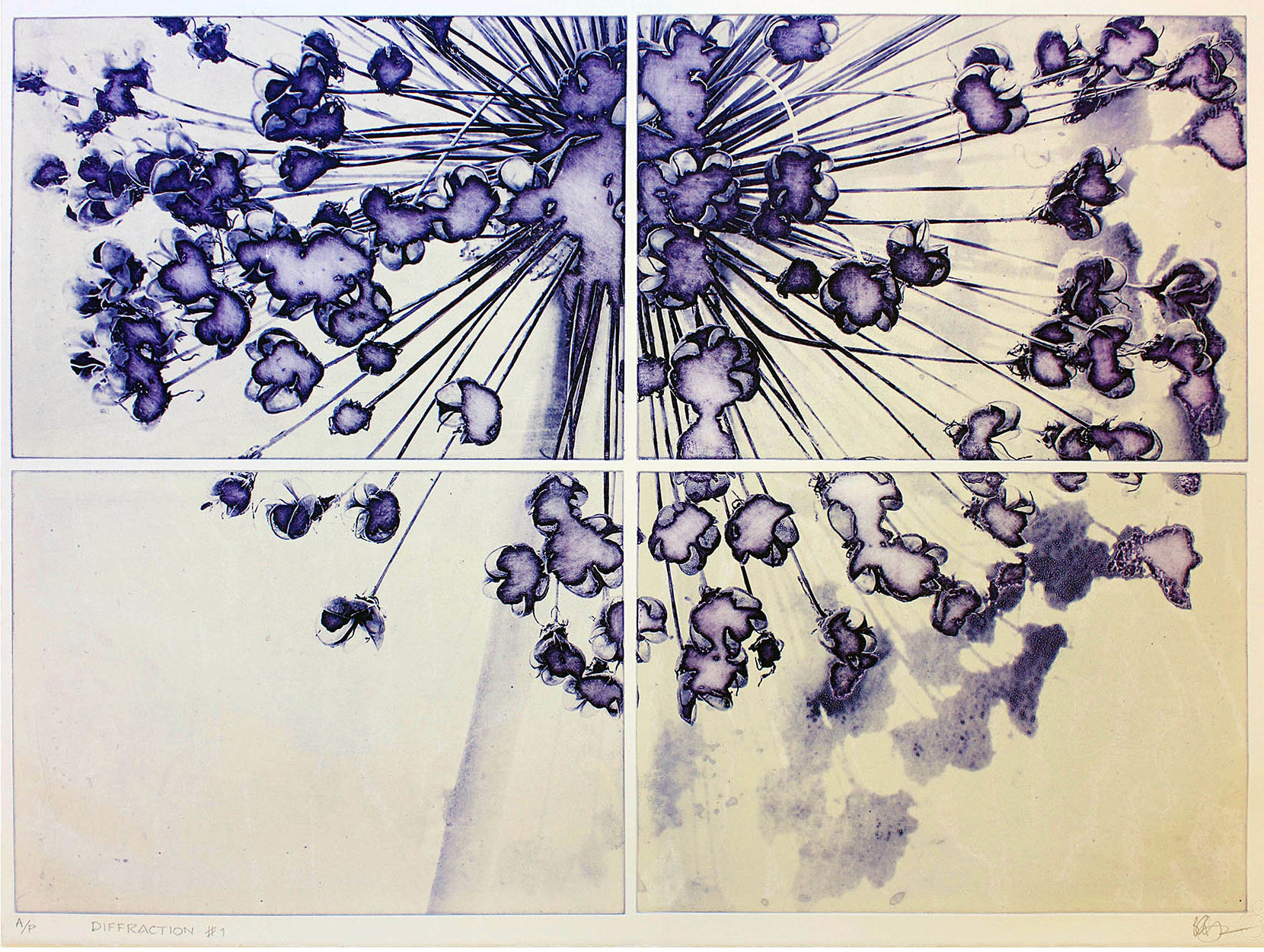
This purple/stone colour variant is the original version to get a feel for the plates and how they will look together. The four together gave me the inspiration for the title ‘Diffraction four’. I am pleased with the result, and I really like the smoky emptiness where the black seeds once sat, but I have a bit of a problem as I have only a few millimetres each side to place the plates up to the roller. It is possible but fiddly and I keep catching the inked plate on the paper.
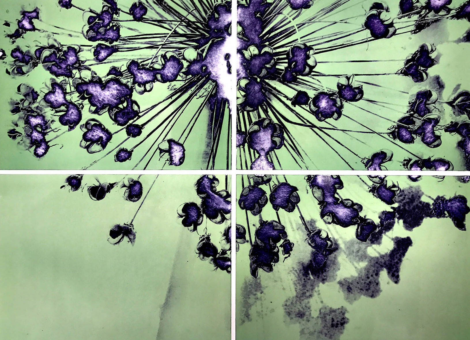
My daughter told me that she had just the right place in her house to hang one of my new pieces, but it has to be green! Normally I would be a bit dismissive of matching to the decor but I think this has really worked well. I try a range of ideas to help minimise the inky messiness including covering the plates with cellophane while positioning them, but everything I try messes with the lovely flat tone and gives it a marbled look.
Its because I’m inking plates for single pass through the press, Inking the purple first with lots of plate oil to make it runnier than usual. This is helpful as it really gets into the intagliations (the etched micro pits that take the ink) and is attracted strongly to the polymer which is lipophylic (oil-loving). I then rolled over the relief coloured ink which I have modified by adding magnesium carbonate powder to make it stiff, which seems to work to minimise the purple ink setting off against the colour on the roller. I picked up this technique from Printmaking in the Sun by Dan Welden and Pauline Muir. As it is an American book it uses a lovely metaphor of peanut butter and jelly sandwiches, where spreading the jam on the peanut butter doesn’t result in any mixing due to the differences in the viscosity between the two spreads.
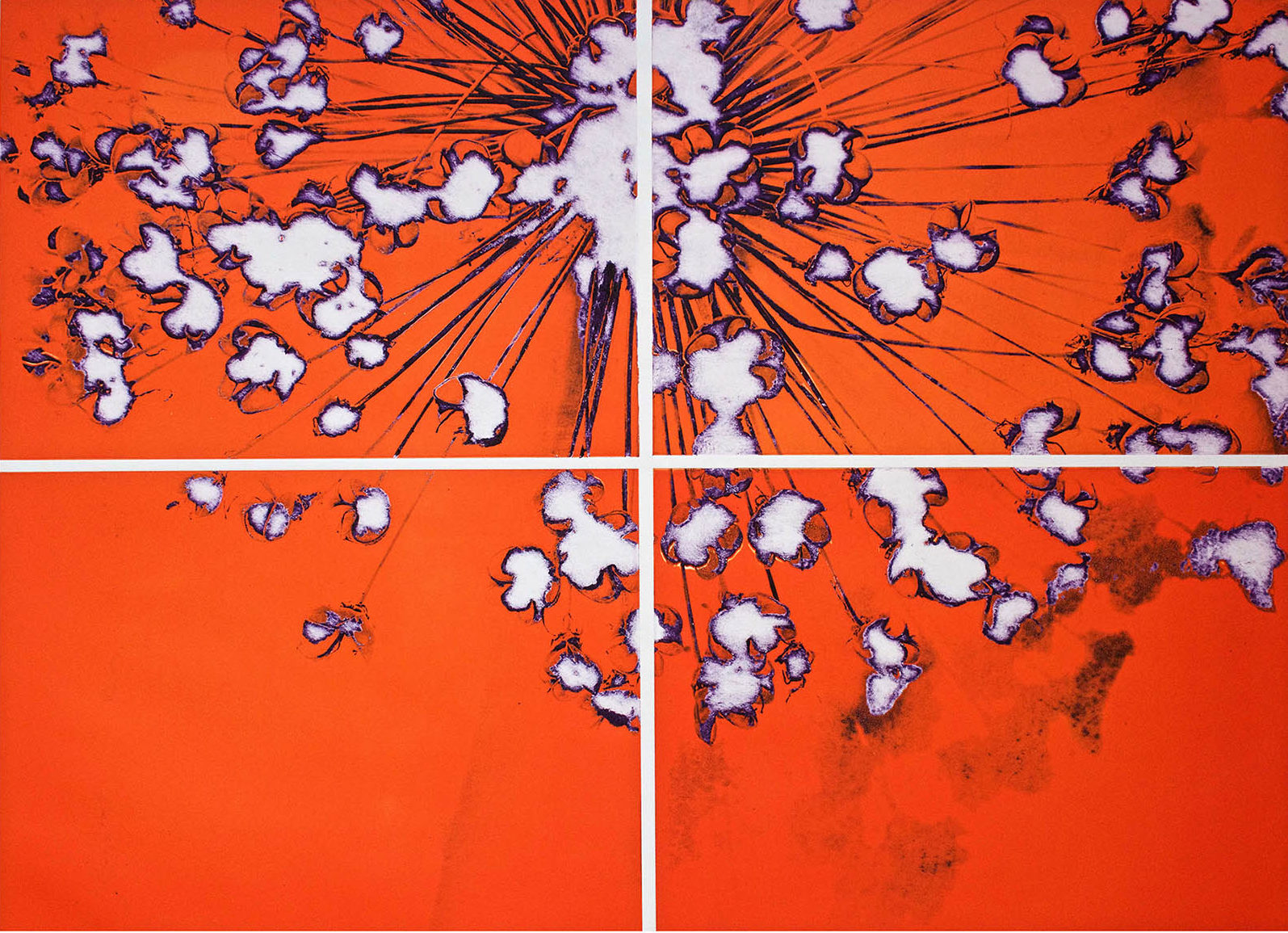
I finally decide on a strongly coloured orange and purple variant as I wanted to create a really strong statement. And I have also decided to cut down the plates in order to give me an extra 20 mm of room at the edges to make it easier to fit the plate alongside the roller. I am so pleased that I submit it for this year’s Royal Academy Summer Exhibition, but I am afraid to say that I have not been shortlisted this year. As you never know what the theme of the show is before the final show is unveiled then it is always a bit of a lottery. I feel that it is at least as good as last year’s successful entry.